Finding Forever
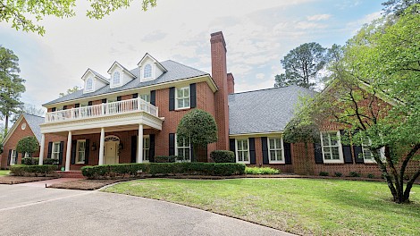
As a family of six, space and location were key factors when Sarah and Dr. Mike Wages were house shopping eight years ago. They eventually found the perfect-sized house just minutes from work and school, making it easy to overlook the dated decor to see the home’s potential. Sarah was also particularly drawn to the classic colonial architecture and the quiet cul-de-sac where she could easily envision the kids safely playing. Fast forward several years and the dated decor began to feel restrictive, but Sarah struggled to figure out how to make an update that still felt true to the home’s architecture. However, meeting with designer, Lauren Callaway, helped her imagine ways to give the house new life. “I didn’t really know Lauren, but I was friends with her on Facebook and saw that she was looking for a house for a client, and ours fit what they needed. I reached out to her and said, ‘I’ve never really considered selling, but maybe.’ And when she [Lauren] got to the house, she asked me why would I ever sell?” From that moment on, Sarah felt confident that with Callaway’s help, they could remodel the house and get exactly what they wanted.
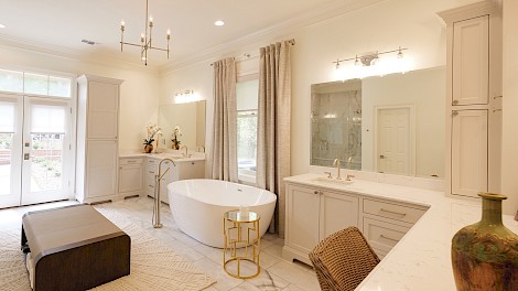
The goal of the remodel was to highlight all the timeless, existing features of the home while updating the parts that felt tired or out of place and to accent with treasured family keepsakes. The bathrooms and the kitchen were the areas that received the most attention throughout the remodel. “This was actually gutted down to the studs,” Wages said, describing the primary bathroom. “It had a corner fireplace and was very dark with black slate tile and black countertops.” The primary bathroom had ample space and custom features, but the dark finishes and open, integrated laundry room left it feeling more utilitarian than relaxing. “I didn’t want the bathroom looking like a workhorse,” Wages continued. Callaway’s simple solution was to swap the small existing shower and the large open laundry space, allowing instead for a spacious, spa-like, two person shower while maintaining ample room for a stack washer and dryer in the new enclosed laundry area. Cabinetry was custom built to allow for ample counter space and more room at the secondary sink. Traditional details, like layered crown molding, were added, but also done in a simplified, contemporary style, helping to balance the traditional and modern. The soft white walls and light grey accents emphasize the spa aesthetic that Sarah was after. A sleek chandelier and designer touches like the acrylic curtain rod bring just a touch of glam.
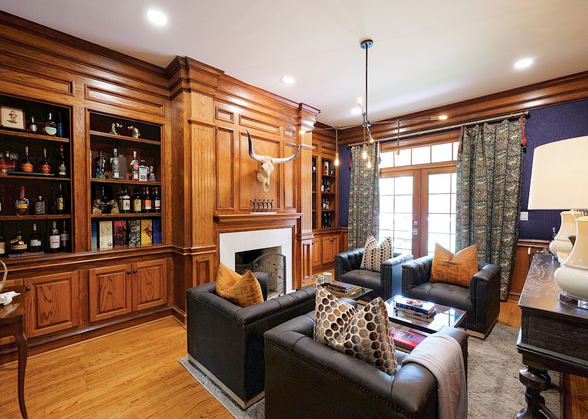
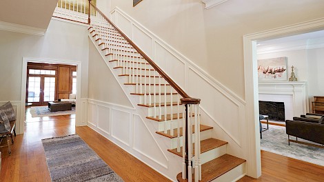
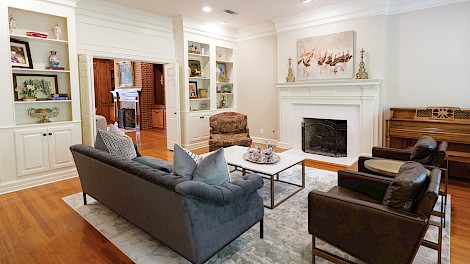
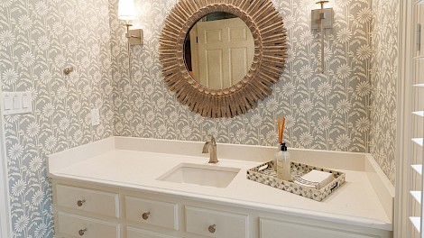
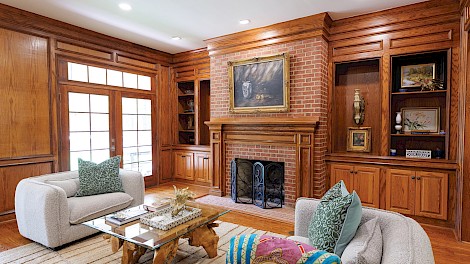
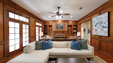
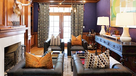
Continuing downstairs, the powder bath was updated with freshly painted cabinetry and a fun monochromatic floral wallpaper, reflective of the energetic personality of the Wages family. Across the hall is Mike’s office. He does not use it much for work, but enjoys having a quiet space to retreat. In this room, like so much of the downstairs, Lauren and Sarah saw the beauty in keeping existing features and focused on integrating these features into the overall design. In the office, this meant keeping the custom tapestry curtains, the meticulously crafted paneling and built-ins, as well as the unique fabric-covered walls, then using a combination of traditional furniture and sleek, masculine pieces to create a gentleman’s lounge. In the main living room, the existing fireplace, French doors, warm wood paneling, and beautiful hardwood floors were all given the attention they deserved. These original features help the house feel inviting and genuine while also making the perfect backdrop to the clean lines and current feel of the furniture pieces curated for the space.
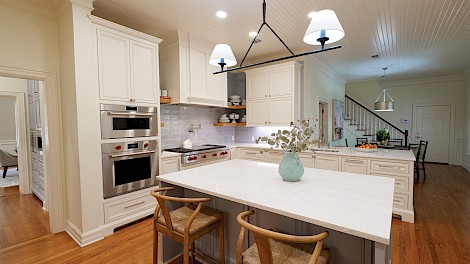
Adjacent to the living room is the kitchen. By maintaining the existing footprint, the Wages kept the original hardwood floors, bringing continuity to the downstairs. The kitchen received a full transformation to the tune of cabinetry, a new backsplash, and lighting. A large center island is the kitchen’s focal point and continues to serve as the heart of this busy home. The island was painted a soft blue-gray, and a coordinating backsplash tile brings cohesiveness while adding personality. “When she first brought that over here,” Wages said, referencing the blue tile, “I was afraid it would look like the country blue and mauve from when I was a kid, but I love it. And it’s a feature you probably won’t see at someone else’s house.” The beautiful blue also blends perfectly with a set of china that Sarah inherited from her grandmother. Other items downstairs that hold special meaning include five charming pottery cups completely handmade by Sarah’s niece as a Christmas gift and proudly on display in the butler’s pantry and an Early American bench in the foyer that once belonged to the dining set Sarah ate on with her family every night as a child.
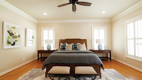
Upstairs, each of the kids’ bathrooms was given a facelift, and accents of powder blue and gray continue. Each room also emphasizes the personality of its occupant. In their oldest son’s room, pennant banners from his dad’s childhood add a focal point while also revealing the family’s love for sports. In another room, a custom Razorback-themed quilt stretches across the bed. The quilt was a gift from Sarah to Mike after he graduated from medical school. It includes t-shirts from high school and college, baby clothes, and other special pieces of clothing from Mike’s time during medical school. In their daughter’s room is an heirloom quilt that Mike’s great-aunt gave them as a wedding gift and his grandmother’s china cabinet that she uses to display her dolls.
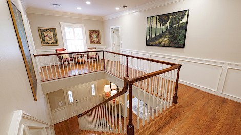
Moving down the hall is an upstairs hangout space ideally suited for their growing crew. Like the rest of the house, the space is cozy and inviting. One recent addition to the area is a set of four charcoal portraits sketched by local artist Daniel Rushing. The portraits have been placed at the bottom of a second staircase, leading to the most transformed space of the entire house—a former attic space converted into a usable third floor. The idea behind the third floor was to add something fun for Mike and the whole family. Luckily, they had just enough space to add a golf simulation room, complete with astroturf flooring, and a full bathroom in case they want to transform the space into something else in the future.
“My husband and I moved so much for school that when he finally finished, all we wanted was a permanent address,” Wages explained. The couple accomplished that goal by embracing the traditional details of their home while simultaneously adding their own personality, resulting in a space they are sure to call theirs forever.

